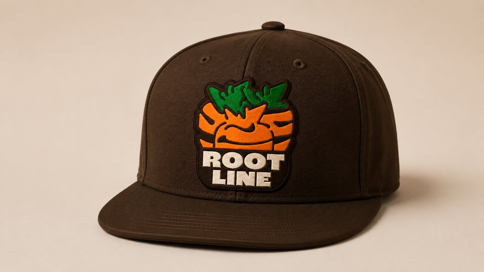
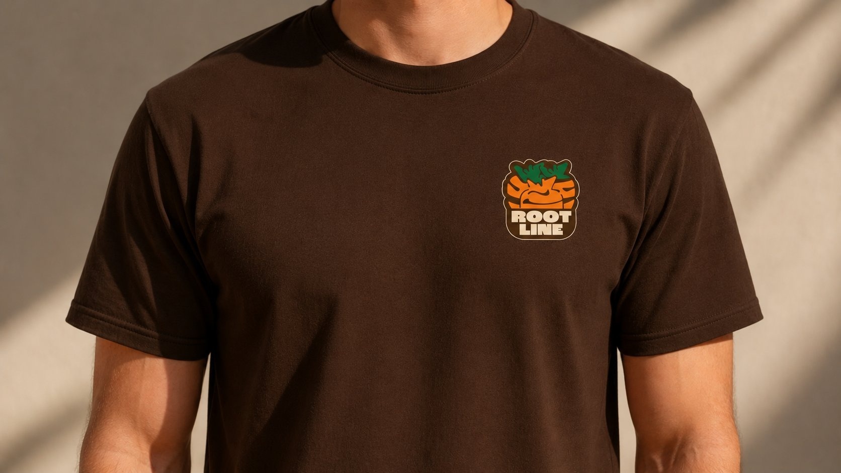
Rootline
Urban farming and agritech is a visually predictable category. Most brands lean into clean sans-serif wordmarks, green gradients, and lab-grade photography. The result: a sea of companies that look interchangeable to anyone outside the industry. I wanted to build the opposite. A brand for an urban farming company that draws from streetwear, heritage workwear, and produce-stand signage — the categories urban farming actually overlaps with culturally, even if the design language rarely reflects it.